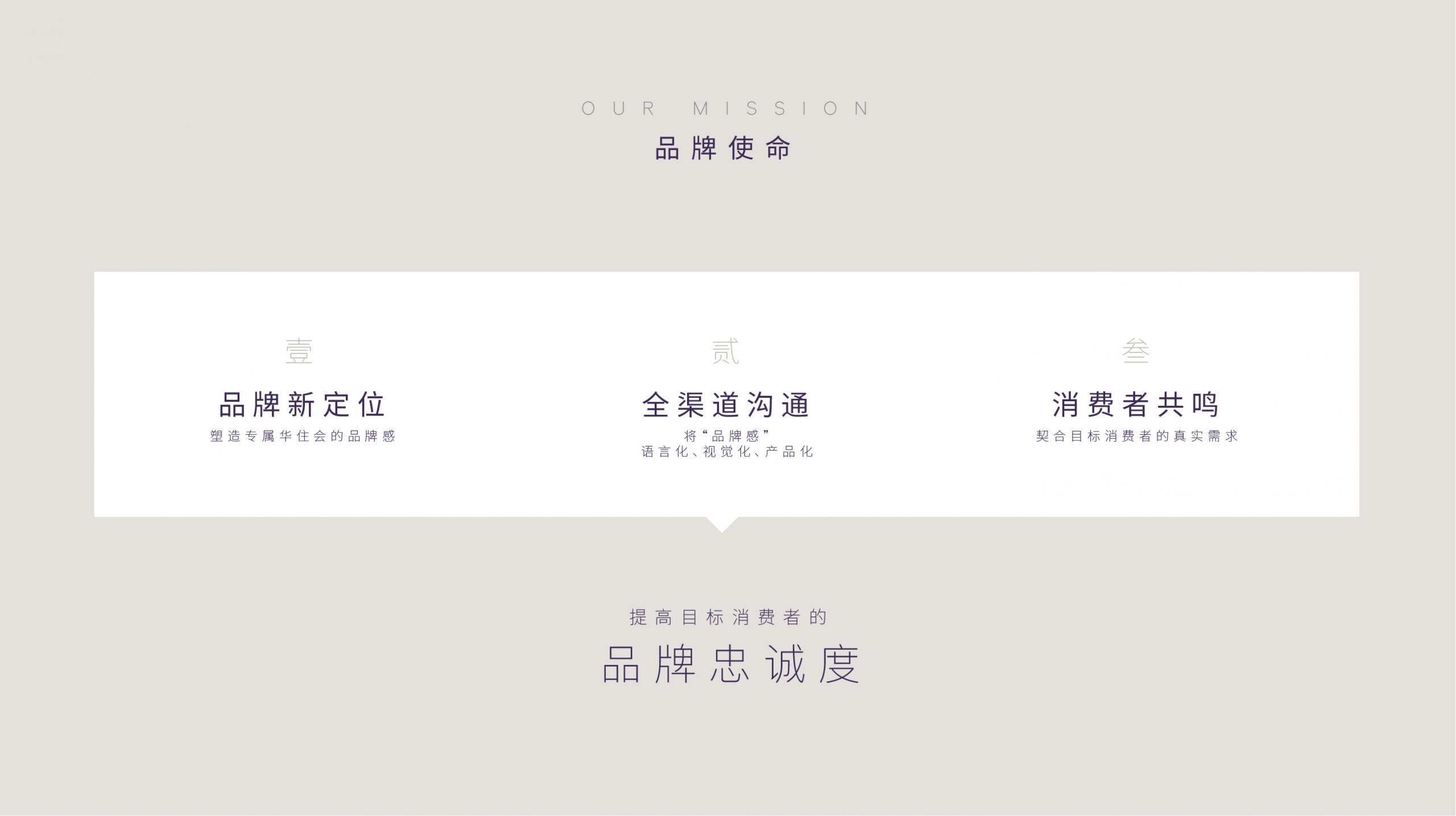
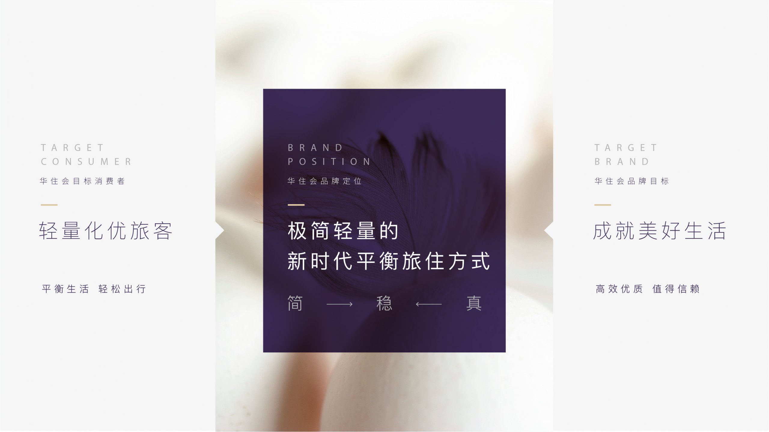
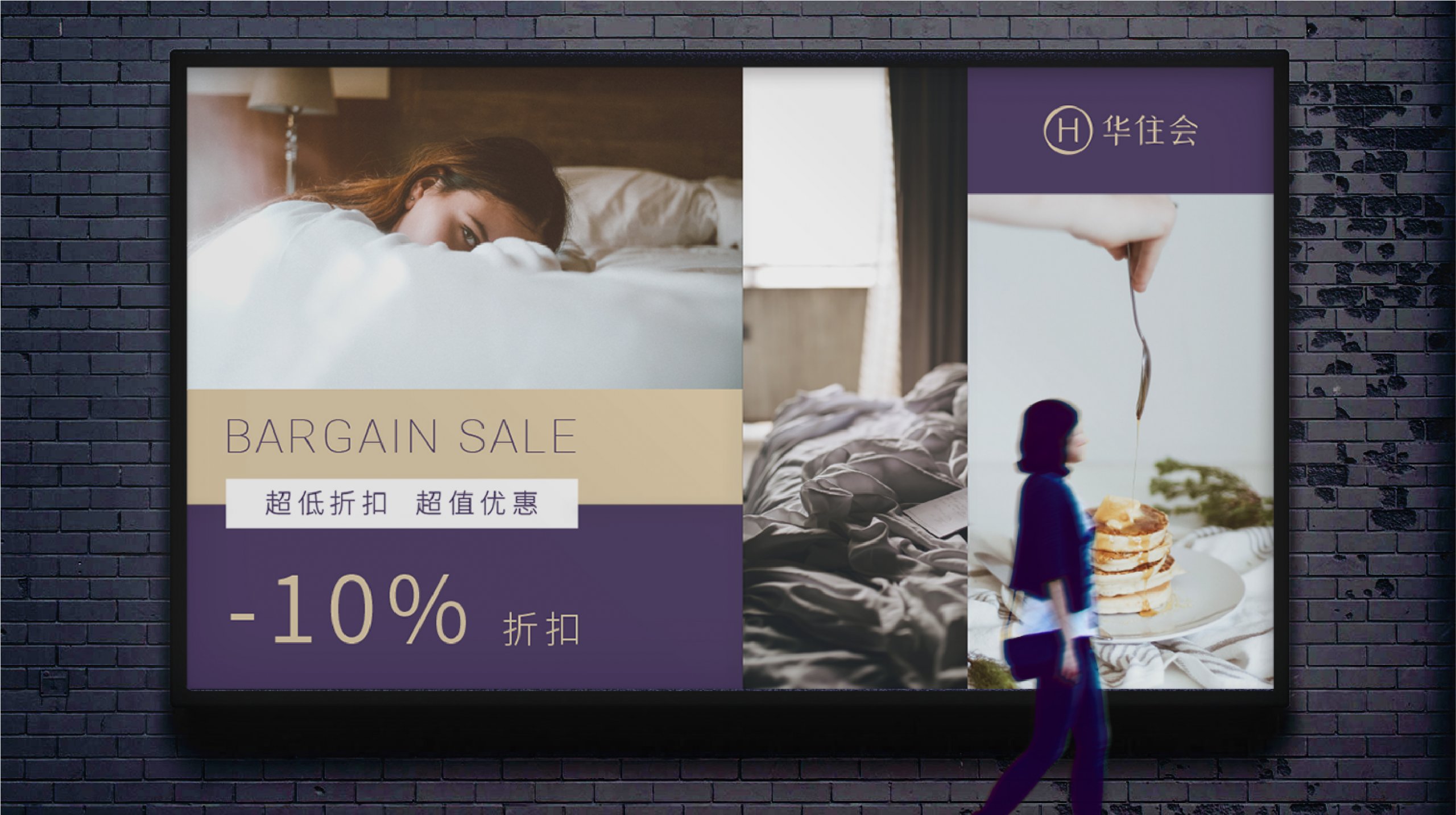
In the early days of its image establishment, h world serves HUAZHU Hotel Group. With the change of brand spirit and the growth of volume year by year, the original visual image has become unable to meet today’s brand requirement. In 2020, GD helped h world to upgrade its brand vision and create new visual image, so that h world can serve its brand members better. Through the visual upgrade, GD also accurately convey the new-era balanced traveling and living style which is simple and lightweight, build close relationship with target consumers and improve their brand loyalty.
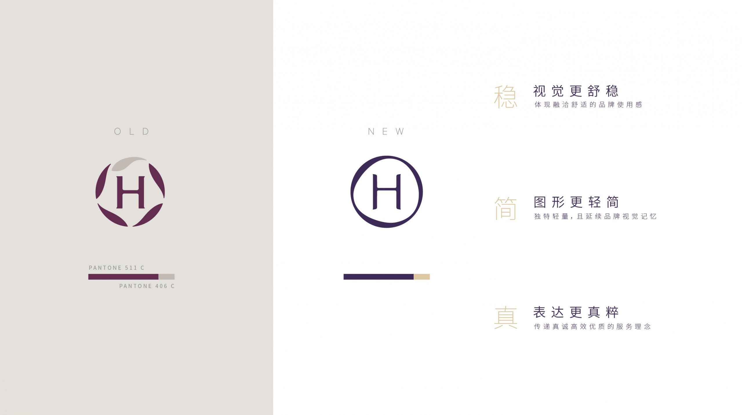
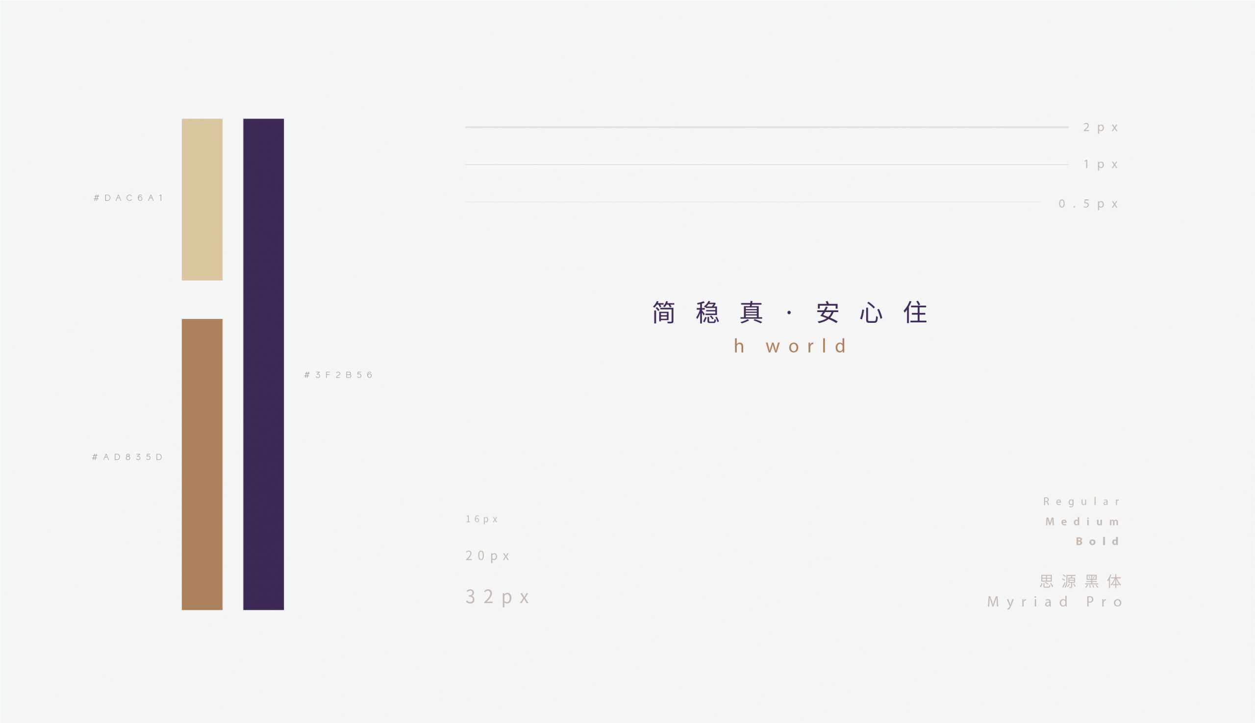
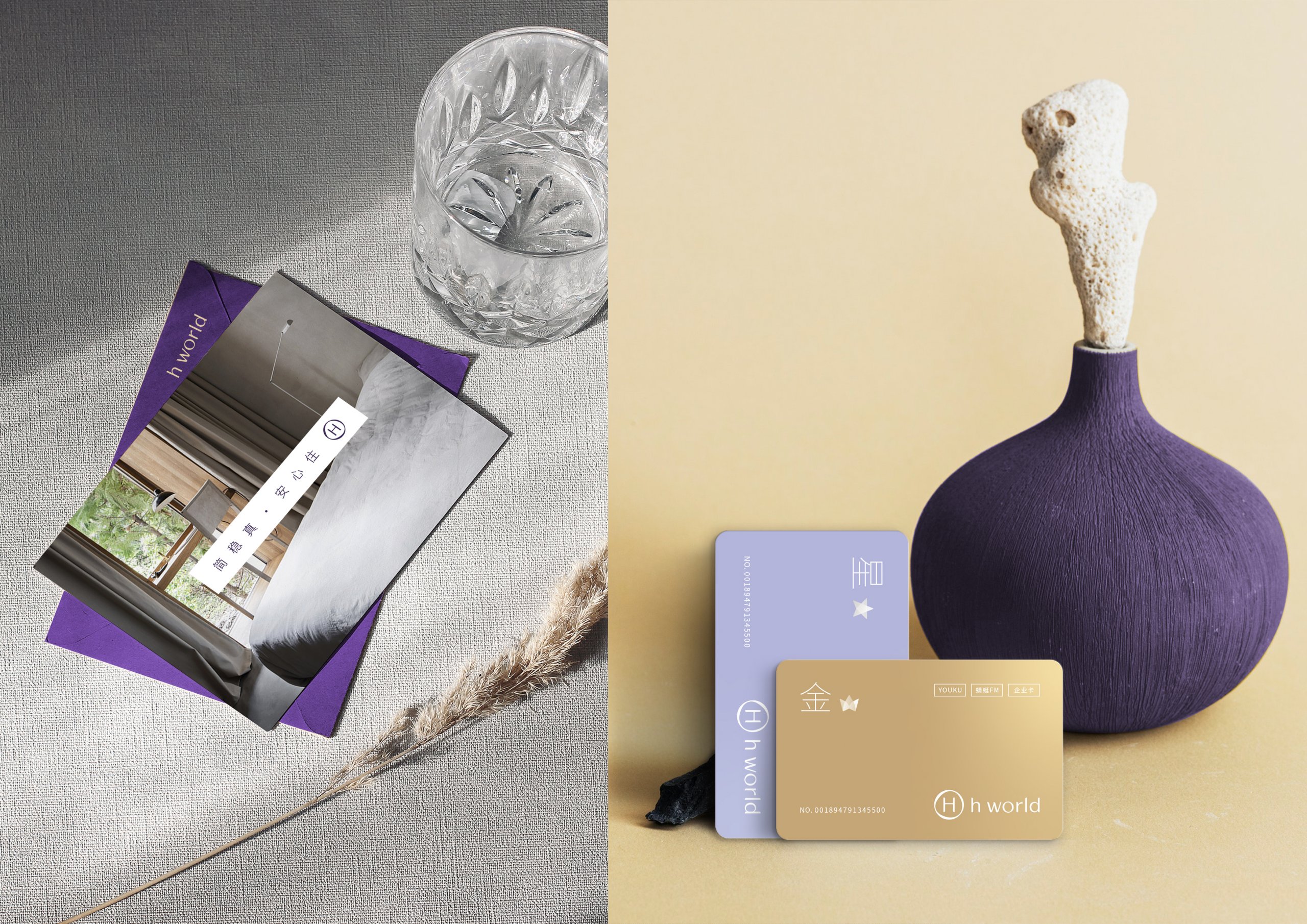
The visual upgrade adhering to the new design concept of “stable, simple, true”, retains the original brand visual and color impression. From a minimalist point of view, the letter “H” with memory points is kept, and the five fish are integrated and simplified to reconstruct a unique lightweight ring, which make the overall image harmonious and comfortable, also express the service concept of brand simplification process and simple operation to customers. Mysterious and noble purple with Oriental feeling, together with elegant and low-key light gold creating an exquisite, stable and true brand vision.
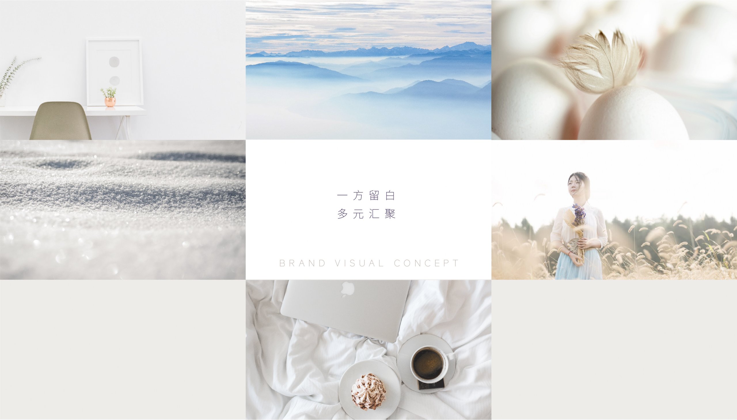
In terms of advertising, we design a new visual concept “a square margin ” for h world to convey the brand concept “blank square margin, multiple convergence”.
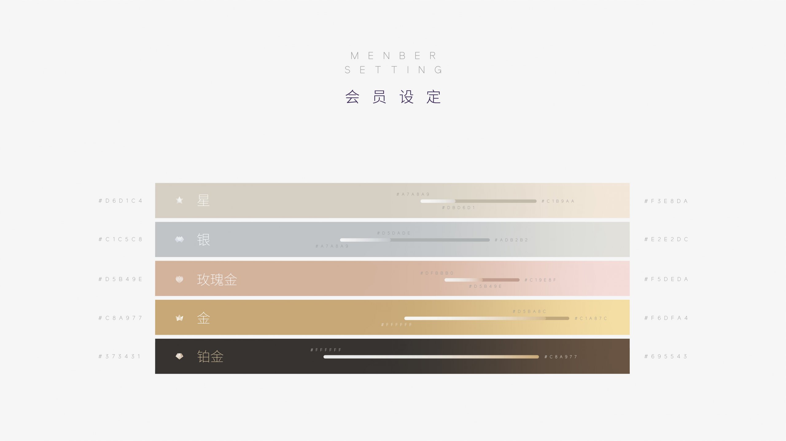
In the application design, GD consider more efficient transmission of official website information, and simplified in the visual interface for operation behavior. So that consumers can receive the information they really need at the first time and enjoy the select services provided by h world.
